Case study
Rena Companion
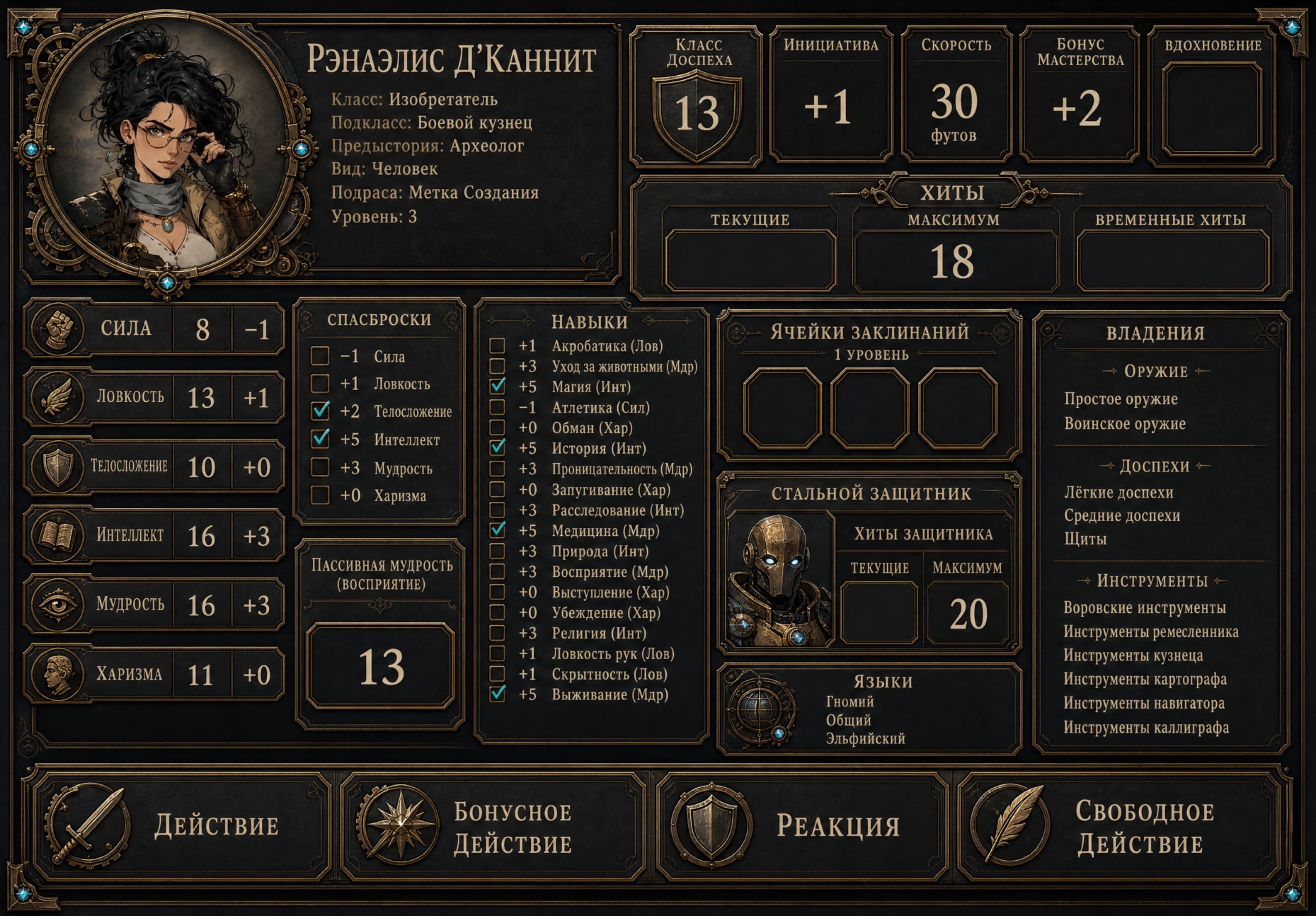
An offline iPad companion that turns a complex tabletop character into a fast, visual interface for live play.
Role
Product Designer, UX Designer, iOS Developer, Information Architect, Visual Designer
Year · Status
2026 · Personal project, in active use at the table
Stack
Links
Context
Rena Companion is built around one real character, but it solves a problem that shows up in every information-heavy tabletop sheet: too much data, not enough of it reachable in the middle of a live session.
Constraints
- — iPad only, used at a physical table
- — must work with zero network connection — no server, no account, no sync
- — built for a single player and a single character
- — a dense ruleset (spells, items, features, a summoned companion) has to stay fast to navigate
- — images are part of the interface, not decoration
- — state changes constantly during play and has to be trustworthy
Context
A real character, a universal problem
During a live game, a player constantly needs to find an ability, check a spell, track HP, or remember what a resource does — while flipping between a character sheet, a rulebook and scattered notes. A paper sheet or a PDF doesn't make any of that faster; it just moves the same clutter onto a screen.
Rena Companion was built around one specific character — Renaelis d'Cannit, a Battle Smith Artificer — but the interface problem it solves is general: how do you make a dense, rules-heavy character genuinely fast to play, not just digitally stored.
Goals
What the app had to do
- Work fully offline, with no account and no server
- Present game materials visually, not as a wall of text
- Make finding an action or ability fast under table pressure
- Track changeable resources (HP, spell slots, companion HP) reliably
- Deliberately leave out a dice roller — that's not the problem being solved
User flow
Using the app mid-session
Interactive prototype
Try Rena Companion on the web
A focused browser adaptation of the iPad app. Change HP, undo a resource update, open illustrated inventory zones, spend spell slots and search the local compendium — the state stays inside this page.
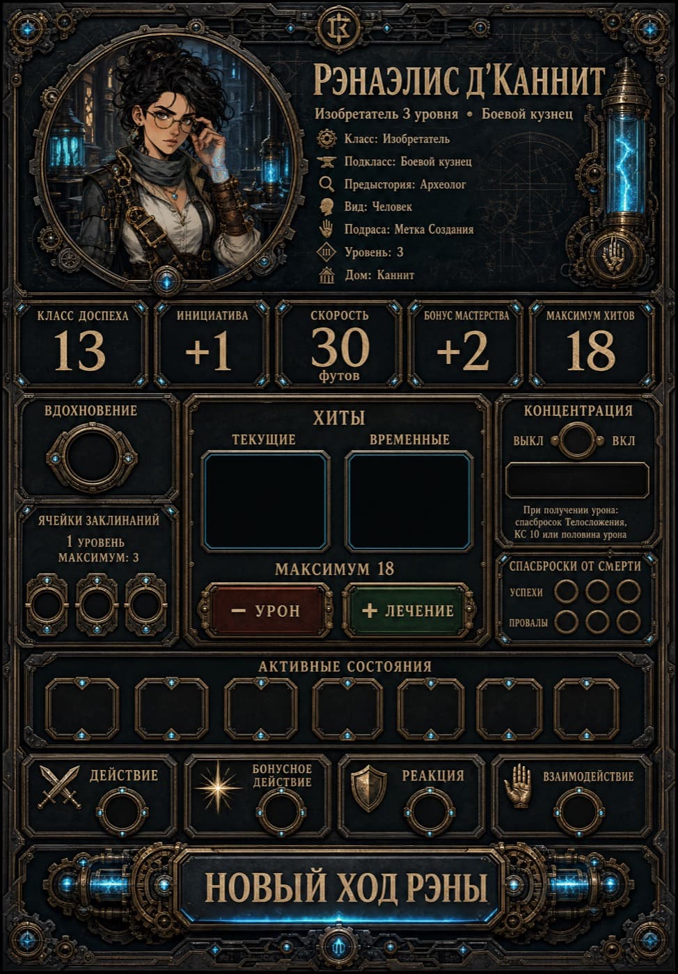
Прозрачные кнопки поверх «− УРОН» / «+ ЛЕЧЕНИЕ» на иллюстрации меняют хиты — как в приложении.
Information architecture
Static content, separated from live state
- Rena Companion
- Dashboard
- Character state
- Resources
- Recent materials
- Favorites
- Compendium
- Spells
- Items
- Features
- Actions
- Interactive maps
- Inventory
- Spells
- Features
- Utilities
- Search
- Journal
- Diagnostics
- Settings
Key UX decisions
Choices that shaped the app
01
No standard, overloaded character sheet
Instead of one dense grid of stats, the app is built around a dashboard plus focused, full-screen materials — closer to how the character is actually used at the table.
02
Interactive zones over hand-drawn maps
Three illustrated maps — inventory, spells, features — carry 40 tappable zones that open full-screen materials, keeping the original visual style instead of replacing it with generic UI chrome.
03
Static content and mutable state, kept apart
The compendium and maps load from bundled JSON and are never touched at runtime; only character state, resources, favorites and history live in SwiftData. This makes the data model easy to reason about and safe to extend.
04
Local search with synonyms and an availability filter
Search runs entirely on-device, understands informal synonyms for abilities, and can filter down to what's actually usable right now.
05
History and undo for every resource change
The last 100 changes are tracked, so a misclick during a tense combat round is never a real problem.
06
No dice roller, on purpose
Adding a virtual die would have been easy and would have added nothing — the app stays scoped to the problem it actually solves.
Iterations
What changed through real use
01
Fixing interactive zone alignment
Tap zones on the illustrated maps needed repeated correction against the actual rendered image rect, handled by a dedicated aspect-fit layout calculation.
02
Unifying image assets
Early assets were inconsistent in style and aspect ratio; later passes standardized how compendium art and map illustrations are sized and displayed.
03
Simplifying navigation
The app settled on a single full-screen NavigationStack with a section menu, rather than split columns that don't suit an in-hand iPad at the table.
04
Adding diagnostics
A dedicated screen now checks content, maps, links, resources and assets for consistency — useful given how much of the app depends on hand-authored JSON and image coordinates.
Final result
The app today
Interactive inventory map
Full-screen compendium card
Challenges
What was hardest to get right
Keeping interactive zones precisely aligned to hand-illustrated maps across different screen contexts required isolating the image-rect math (AspectFitLayout) from everything else, rather than eyeballing coordinates per screen.
Coordinating resource usage — a spell slot, a limited-use feature, concentration — through one ResourceService and one MaterialAvailabilityService kept the rules consistent without scattering that logic across every screen that touches state.
Reflection
What the app got right, and what's next
What worked well
Separating static compendium data from mutable character state made the app far easier to extend than a single shared model would have been.
What turned out to be harder than expected
Keeping the tap zones on illustrated maps accurate across the interface took more careful layout math than a typical form-based UI ever would.
How real play shaped the product
Actually using the app at the table — not just testing it — is what pushed features like undo, favorites and the availability filter from 'nice to have' to necessary.
Next project
Naila →
A solo Unreal Engine 4 project built to practice character movement, level design and visual storytelling.